Sure therapists are expected to know everything when it comes to matters of emotions – and many do have all the answers.
But when it comes to technicalities such as creating a ‘perfect’ therapist website – it’s okay to admit that you have no idea what you’re doing.
Honestly, there’s so much to take care of when creating a website that it’s absolutely alright to feel overwhelmed. And that’s why this article can be your checklist.
Let’s take a look at some of the best therapist websites (in my humble opinion) out there and understand what they are and aren’t doing. And at the end you’ll find your checklist!
So, let’s get you some more trauma, shall we? Umm, I mean, clients.
Let’s get started!
Table of Contents
My List of Best Therapist Websites
Jessamy Holland

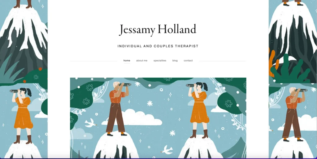
Jessamy Holland’s website is like flipping open a comic book that instantly grabs your attention.
The navigation bar takes you straight to what you want: home, about me, what I do, the blog, and how to get in touch. No endless scrolling or getting lost. Making it very easy for busy professionals.
Each page gets right to the point. No beating around the bush, just the straight-up good stuff you came for.
And those illustrations – mountains, people doing their thing – they’re not just there to look pretty.
They’re like little stories themselves, painting the picture of therapy as this epic adventure.
It’s clever, right? The whole design doesn’t just catch your eye; it pulls you into the journey.
Check out the website here.
Theraphe

Theraphe’s homepage nails it right from the get-go with a headline that catches you off guard: “Counselling for men who don’t want counselling.”
It’s like it’s speaking directly to you, promising to turn you into a better husband, dad, and all-around guy.
And just like on the other websites, here too the navigation bar is right there front and centre – making it a breeze to find your way around.
The ‘Featured On’ section is like a seal of approval right on the front page, letting you know you’re in good hands because hey, if the media’s noticed, you’re onto something good.
And when you head over to the ‘Men’ page, it’s all laid out there. And each page has the ‘Schedule a Session’ button, like a friendly nudge, not too in your face, just reminding you they’re here when you’re ready.
It’s like the site gets it – gets you – and it’s not just about talking; it’s about turning those talks into real change.
Check it out here.
Shiromi Chaturvedi

What’s really cool about this website is that everything’s on one page. No hopping around from tab to tab; whether you’re looking for services or just wanna read up on some glowing testimonials, it’s all right there, one smooth scroll away.
The design is brilliantly user-friendly, making everything so intuitive.
It’s designed to pull you in, encourage, explore, and begin your journey with a sense of trust and total ease.
Take a look at it here.
David Brown

Right when you hit this site, you can tell they know their stuff. You’re greeted with buzzwords like “Analytic, Integrative, Relational, Spiritual” front and centre.
The text is super clear, easy to read, and pops out against this cool, slightly faded video of city scenes.
It keeps things interesting without making it hard to see what’s what.
Love the fact that they’ve mentioned where they’re based out of, which is pretty neat if you’re local and looking for someone close by. The site doesn’t just skim the surface; it goes deep, just like their therapy sessions.
You’ll find pages loaded with answers to all your burning questions, making the whole experience welcoming and value driven.
Check out the website here.
Rivanna

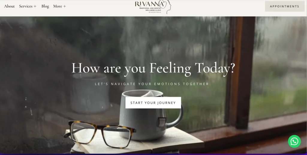
Right from the start, Rivanna’s site greets you with, “How are you feeling today?”, like a friend checking in on a rainy day. Scanning through the site, you’ll see it’s really straightforward, sticking to just a couple of main colours. This makes spotting what you need super simple.
You’ll also see testimonials, which really adds to the trust factor. And the navigation bar at the top is your easy-peasy guide to the essentials – services, blog, about page, you name it.
All in all, it strikes a cool balance between being approachable and professional, making you feel comfortable while providing all the details you need.
Check it out here.
Rachel Rudman

Rachel Rudman’s website is all about bringing the fun of paediatric occupational therapy to life. Move your mouse around, to have some fun and leave a colourful trail of handprints behind.
This whole adventure of ‘Experience Success Through Play’ doesn’t just make the site more fun; it turns the whole visit into something you’ll remember and smile about. The site keeps things simple and straight to the point, making sure you can easily get what you need without any fuss.
In the ‘services’ section, you get more than words. You get pictures that pop, showing you exactly what’s on offer. This site doesn’t just talk to you; it invites you to play along. It’s a brilliant way to show off how Rachel’s therapy isn’t just effective; it’s a blast.
Have a look at the website here.
Sonali Gupta

Hello!
That’s literally what the website starts off with – and it’s amazing! Suddenly, you’re not just visiting a random website, you’re starting a conversation, building trust with the visitor and setting a casual tone for the rest of their visit.
The design is clean and straightforward, with a neat blue and white colour scheme that keeps the focus tight on what matters: the message.
Sonali doesn’t just talk the talk; her ‘clients’ and ‘webinars’ pages are jam-packed with shoutouts from happy clients, providing solid proof of her expertise and down-to-earth approach. It’s a smart way to build trust, showing she’s not only knowledgeable but also genuinely approachable, all in a setting that’s inviting and far from pushy.
Check it out here.
Minaa B

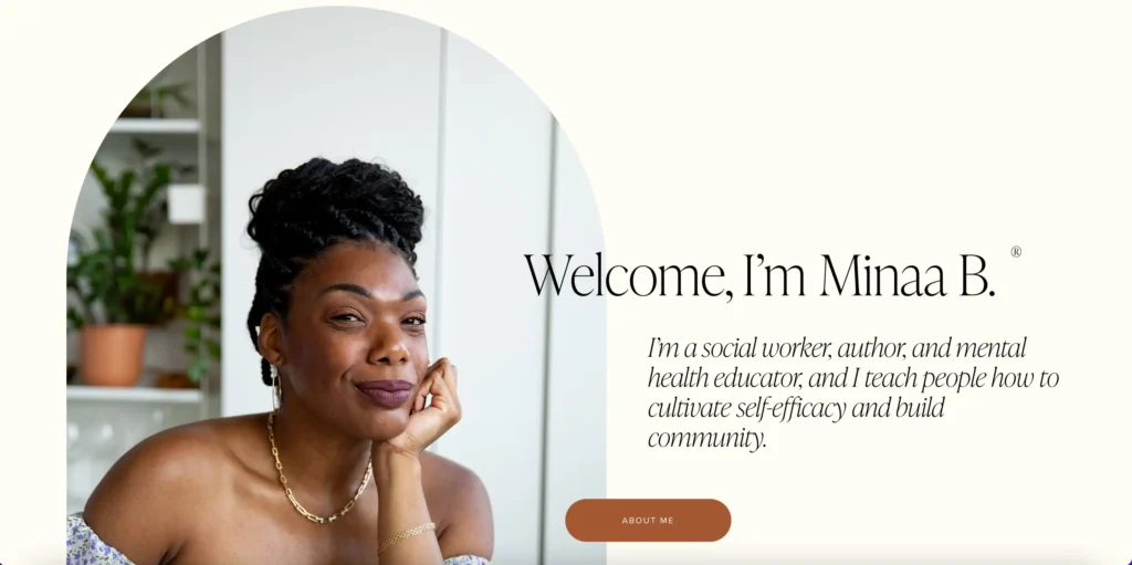
As soon as you hit Minaa B.’s site, her smile gives a warm “come on in” vibe inviting you to explore her world. But what really makes you stick around?
It’s how her ‘About Me’ goes beyond the usual. Sure, she talks about her professional credentials, but she also lets you in on her self-care rituals. It’s a refreshing twist.
Then there’s the clever split in her ‘About’ sections, one for individuals and another for organisations. This means you don’t have to sift through everything to find what speaks to you.
Minaa’s way of laying it all out there—clear and straightforward—feels like she’s talking right to you, answering your questions before you even ask them.
Her setup’s all about making sure everyone feels right at home, highlighting how much she values connecting personally with her audience. It’s a masterclass in showing how a bit of personal flair can make the digital space feel just a bit more human.
Check out the website here.
Angie Richie

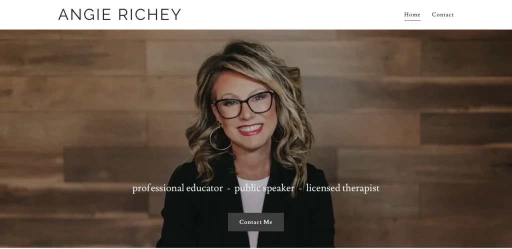
Angie Richey’s site is simplicity at its best: you’ve got your ‘Home’ and ‘Contact’ pages, and that’s pretty much it. No need to click around looking for what you need.
This straightforward setup shines a spotlight on Angie’s professionalism with its clean, clutter-free vibe. It’s as if she’s removed every single obstacle from your path, making it super easy to get in touch.
By focusing solely on the essentials, Angie makes sure that reaching out is a no-brainer.
Take a look at it here.
Bernadette Chavez Piñon Counseling

Right when you land on this site, it’s like it rolls out the red carpet with its colour-coded menu, making it super inviting. Each section expands with a click, mixing in-depth information with user-friendly navigation.
The best part, though, is how this design is mobile friendly. Making it easy for people looking for counselling on their phones.
The expandable bits serve up bite-sized insights, letting you quickly get an idea or, if you find something interesting, go deeper. It’s a clever way to respect people’s browsing time while still laying out everything Bernadette offers, therapy-wise.
You can check it out here.
Finally, let’s understand the Do’s and Don’ts
So, what makes a therapist website really stand out? It’s all about mixing practicality with a bit of visual flair. Think of your website as the digital version of your practice—it’s the first thing potential clients will see. So, what are the key ingredients?
What a Good Therapist Website Includes:
Clear Branding: A coherent brand message that reflects the therapist’s approach and values makes sure that visitors immediately understand who you are and what you stand for. This is not just about a logo or a colour scheme, but also the voice and tone used throughout the site.
Intuitive Navigation: A seamless, easy-to-navigate layout is very important. Helps your potential clients find what they need without getting frustrated, whether it’s your services, qualifications, or how to book an appointment.
Professional Yet Personable ‘About Page’: This isn’t just a bio; it’s a chance to build trust. Highlight your qualifications, experience, and any specialisations, but also share a bit of personal backstory or philosophy to connect on a human level.
Service Descriptions: Clearly talk about the services you offer and what clients can expect. This section should answer common questions and deal with anxieties about the therapy process.
Contact Information: Simply put – make it easy for clients to reach out. Display contact details front and centre or provide a simple, secure contact form.
Testimonials and Success Stories: With proper consent, share testimonials of clients and make case studies about how you’ve helped others. This can really help potential clients feel like you’re good at what you do.
Resource Blog: Share valuable content that offers insight into your expertise and provides free help. It positions you as an authority and is excellent for ranking.
What a Good Therapist Website Avoids:
Medical Jargon: Overly technical language could result in people not understanding a thing. Keep the copy relatable and accessible.
Overwhelming Design Elements: Too many visuals or complex designs can be distracting. A clean, calming design is more effective.
Neglecting SEO: Visibility is vital. Ignoring SEO best practices can mean your website won’t reach the people who need you most.
Ignoring Accessibility: Make sure your website is accessible to all potential clients, including those with disabilities. This means readable fonts, alt text for images, and a compatible layout for screen readers.
Lack of Privacy Assurance: With sensitive topics, clients need assurance of confidentiality. Make sure your website’s security features are up to par and communicated clearly.
A good therapist website doesn’t just inform; it feels personal and offers reassurance. It is a reflection of the therapeutic process itself – a journey of discovery, understanding, and connection. Keep these inclusions and exclusions in mind to create a space that’s not only informative but also inviting and comforting.
Wrapping Up
These best therapist websites reveal some commonalities: the impactful blend of user experience and personal narrative. These therapist website examples combine aesthetics with functionality, guiding potential clients through a journey from curiosity to contact with ease.
Through my expertise, I help therapists create websites that are not just discoverable, but memorable and engaging. From custom design to advanced SEO techniques, each element is carefully crafted to reflect the unique essence of your practice, ensuring your website speaks directly to those seeking your help.
Your website’s journey doesn’t end at launch; it’s an ongoing story of growth and connection. Want me to build your site? I would love to. Hire me.


Muskan Garg
Muskan's been an SEO Strategist for over 5 years, helping websites get noticed and climb the ranks on search engines. She's really into how people behave online and loves using her critical thinking skills to come up with personalized SEO plans for her clients. Her SEO expertise is featured on Entrepreneur, Marketer Interview and more.


