Have you ever looked at website builders and felt, ‘’Ohh no, this is too much’’?
We understand your pain.
Even though most website builders promise to be user-friendly, they have a steep learning curve, which you may not want to go through!
That’s where platforms like Carrd.co are getting popular.
Need a one-page site built within an hour? Gotcha! You can build it, or ask someone to build it.
One of the most important perks of using Carrd.co is zero maintenance.
Yes, you don’t have to go through the headache of managing hostings, updates, codes, nothing. Carrd.co handles everything for you.
So now, let’s take a comprehensive look, and understand the step-by-step Carrd tutorial for beginners.
What is Carrd.co?
Carrd.co was launched in 2016. Since its inception, over 39,000+ users have used Carrd.co to build their website.
Their interface is built with keeping non-technical users in mind. It’s very intuitive even for beginners. And best of all, there’s no need for code.
However, what makes Carrd.co stands out in a sea of website builders is its simplicity.
Carrd. co has only a one-page layout, leaving no place for confusion.
So, if you are looking for an easy-to-manage website builder, then Carrd.co is something that you will love.
Okay, now let’s jump to the interesting part, i.e., creating your own Carrd.co website! We promise to keep it simple.
Step-by-Step Carrd Tutorial
Below are the steps included in Carrd Tutorial. Follow all these steps, and craft a simple, easy, and free website in minutes.
1. Sign Up and Create New Project

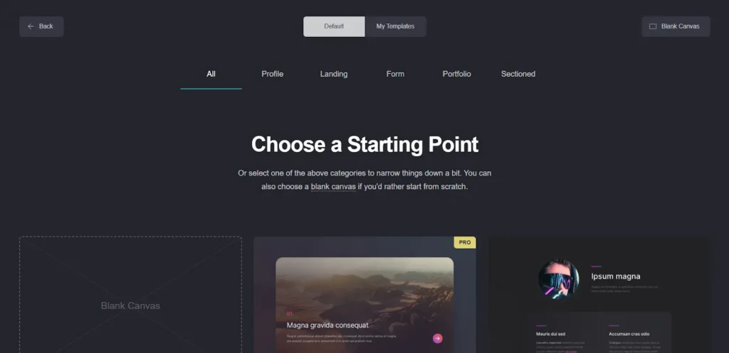
Visit Carrd.co and sign up. Verify your email before creating a new project. Once verified, select a new project. Once selected, you can choose one of the prebuilt carrd templates or start from a blank canvas.
2. Start Customizing The Website
You can customize a template or blank canvas once you have decided on one.
- Edit content: To modify content, merely select the desired content to edit. You can then change the text from the sidebar editor.

- Add Sections:
What if you want to add new sections? Click the plus sign in the top right corner to add a new section. A drop-down will appear. Choose the container option from the Dropdown and a new container will be added. You can customize this container
- Upload Images:
- Adjust image size and position as needed.
- Change Colors and Fonts:
There are several other options to change the appearance, including, text font, size, height, line spacing. Adjust accordingly and click save.
3. Edit Links and Buttons
Carrd makes it easy to add and design buttons for including your call to actions. Here’s how you can add a button to your page.
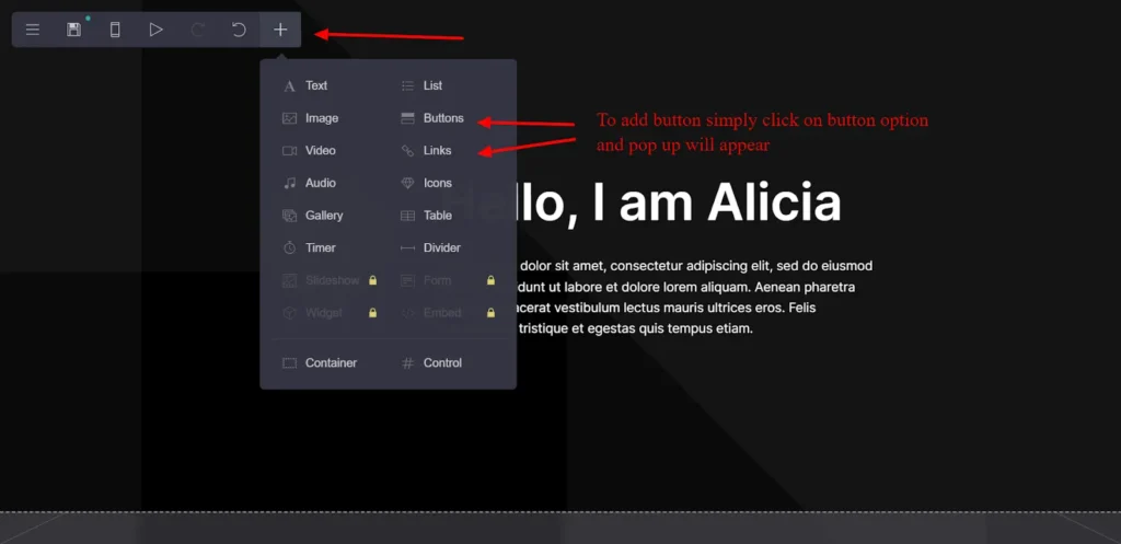
There are several options to customize your button. You can add links to direct users to other destinations. You can also change the size, font, color, and animation of your buttons.
4. Set Up Custom Domain (Optional)
Choosing a custom domain is a preferred option as people will know your business is genuine.
5. Preview Your Site
You can preview your site using the preview button. Don’t forget this step before publishing your site.
6. Publish Your Website
Best Carrd.co website examples
#1. Janine Schoberg
Site Link: janineschoberg.com
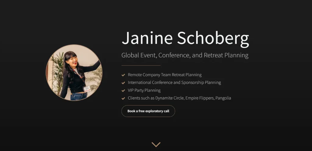
Janine’s portfolio is designed using Carrd.co, and we can’t help but admire its simplicity and beauty.
She has tactically designed her header to cover her unique selling points. The site ends with a calendar booking form to book an exploratory call.
We can definitely take inspiration from this site that even simple things when done right can have a huge impact.
Get Your Website Designed by me. Learn More.
#2. Lifemathmoney Newsletter
Site Link: newsletter.lifemathmoney.com
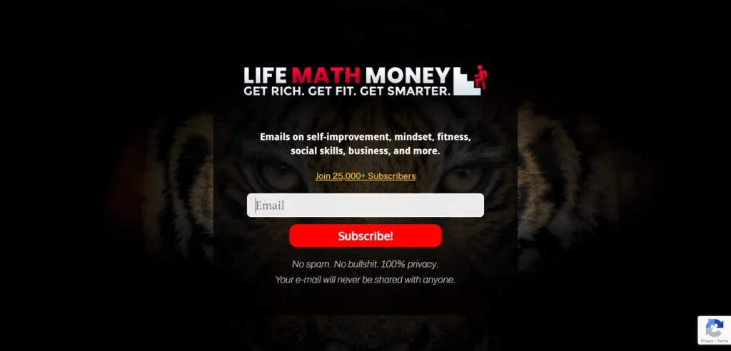
This is an interesting Carrd.co site, as they have used it to build a newsletter landing page. They have over 25,000+ subscribers with over 150,000+ social followers.
Then choosing Carrd.co to build a landing page says a lot. Why? Because this shows that even popular people love simple solutions.
#3. GreenRoute
Site Link: Greenroute.cc
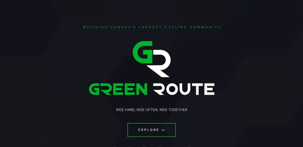
GreenRoute followed a minimalist route while designing their site.
The entire site is soothing and looks like a long business card. The website clearly talks about the GreenRoute missions and welcomes readers to explore more.
The soothing combination of green, sage, white, and black puts your mind at ease.
Get Your Website Designed by me. Learn More.
#4. Impact Origins
Site Link: impactorigins.co

Impact Origins, a marketing agency in LA, uses Carrd to create a sleek and catchy single-page website. The cool part? The page has both moving and still images. Scrolling, the foreground moves fast while the background stays put, making it visually attractive.
What’s really neat is the peachy pink background. It’s eye-catching and stops visitors from scrolling past important info. Impact Origins, with the help of Carrd, makes a fantastic and memorable website that reflects its dynamic marketing approach.
#5. Love Curated
Site Link: lovecurated.com

Love Curated is a curation site built on the Carrd.co platform. As their site mentions, they have been curating the best inspiration and references to help designers and developers create the best works.
It’s a beautiful small business card site that’s linked to Twitter, Email and Presskit. It’s the reason users love Card.co. You can build a beautiful one-page site on custom domains without worrying about hosting.
#6. Abstract
Site Link: abstractlab.co

Abstract is a cool illustration site using Carrd. They make personalized characters for entrepreneurs and artists. Thanks to Carrd, the site is easy to explore with its continuous single-page design.
In their design portfolio, check out the presentation kits. The images pop out when you hover your cursor, making it interactive and fun. The buttons to take buttons to take action are a cool rectangular shape in a light-slate blue color.
#7. Positext
Site Link: positext.xyz

Really Good Questions is a cool website created with Carrd. It shares interesting questions and answers from various groups. The design is catchy, with a tree of light bulbs and black buttons on a white background.
In the main part, you’ll find lots of awesome questions from Twitter, covering different topics and creators. They’re laid out in a cool three-column style, thanks to Carrd.
And at the end of the page, there’s a handy arrow that takes you back to the top. It’s a simple, easy-to-use website that makes exploring questions and answers fun and straightforward, all thanks to Carrd.
#8. SaaSHook
Site Link: saashook.com

SaaSHook is a community that helps SaaS makers and marketers upgrade their websites to turn visitors into paying customers. The website has a clean look with a mix of ghost white, cobalt blue, and purple. What’s cool is the warm blue buttons that pop out when you hover your cursor on them.
In the main section, you’ll see images of their dashboard from a Notion template, showing various pages. It gives you a glimpse of what they offer in a straightforward and visual way. SaaSHook’s website is all about making SaaS websites better, and its design reflects that mission.
Get Your Website Designed by me. Learn More.
#9. Eighty-six Websites
Site Link: 86websites.com

Eighty-six Websites, made with Carrd, is a cool platform that creates simple websites for bars and restaurants. Their own website, built with Carrd, is simple too.
In the main part, they explain their services and pricing easily, so you can quickly understand what they offer. A cool thing is that you can make the online form at the bottom of the page bigger with your mouse. This helps you give them more details about how you want your website, thanks to Carrd.
#10. Weald Construction
Site Link: wealdconstruction.com

Weald Constructions, run by Kevin, the professional contractor, has a cool logo right at the center of the homepage. The bold turtle green button is eye-catching along with the clear CTA round button to take action.
The homepage elements mix well with a stable black and white construction picture in the background. The website has a smooth scrolling feature and a gallery to showcase project work. You can zoom in to see them up close.
This one-page site has simple sections, creating a cool effect. Just like other Carrd websites, Weald construction keeps things simple, making it look clean and stylish.
Get Your Website Designed by me. Learn More.
#11. Juliet Edjere
Site Link: julietedjere.com

Juliet Edjere, a no-code strategist, built her website on Carrd, a tool she used to achieve pro status. Her website looks cool with alternating black and ebony colors. The orange peel-colored buttons and check marks add a nice touch.
In the central part, she discusses her services and work ethic with cool text animations. The projects section shows off her expertise. She has a simple contact form with a checkbox to gather info from potential clients. It’s an easy and engaging way for people to contact her.
#12. Freelancecourse.cc
Site Link: freelancecourse.cc
Freelance course presents their course in the form of a long form sales page. The color combination and flow of elements are used tactically to help users understand the benefits of buying the course. The site ends with FAQs to answer the questions that the audience must have.
As we saw above, Carrd.co is an extremely minimalistic yet functional site builder to help you build aesthetically pleasing yet converting websites.
#13. Transistor FM
Site Link: transistor.fm
Transistor FM, a top podcast host, stands out with a cool hero image on a sleek, dark background. They use a short video to explain why they are the best for hosting podcasts. The site’s neat buttons make it easy for visitors to try Transistor with a free 14-day trial.
Transistor makes up for it with a bright footer, providing quick links to different site pages. This is the best example of a one-page design that feels like a complete website, proving how Cardd can do wonders.
Get Your Website Designed by me. Learn More.
#14. Newsletter OS
Site Link: newsletteros.com
Newsletter OS is the place for creative folks looking for awesome newsletters to grow their clients. The page is super easy to use, thanks to Carrd. It uses a simple background in white and lilac, keeping things clear. The color choice onyx and blue color make this look real professional.
If you see their features section, you will see exactly what cool stuff they offer. The features section is clear and convincing, showing how Carrd can help you build simple things professionally.
#15. Daily UI
Site Link: dailyui.co
Daily UI, a lively design community, uses Carrd to make its website look cool and professional. The site has nice colors like white, pink, and blue and big fonts that make it memorable.
Check out the hero section, where the pictures tilt when you move the cursor over them. It’s a fun way to catch a visitor’s attention.
Thanks to Carrd, Daily UI has cool animations like smooth scrolling and revealing text as you scroll. These make the website more exciting and interactive for designers, showing how Carrd helps create a polished site without needing to code anything.
#16. Dalibor Buranda
site Link: daliborburanda.com
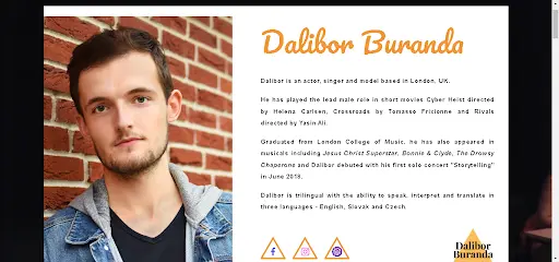
Dalibor Buranda chose Carrd.co to build his business site that resembled a business card. It follows a simple structure.
He decided on a split design where on the left side he uses his photo to create an emotional connection while on the right side, there is his introduction.
Why Choose Carrd.Co Over Other Website Builders?
Almost every website builder in the market is not perfect; Everyone has an upside and downside. So, evaluating whether Carrd.co is right for you is essential. Let’s look at how Carrd.co compares with other site builders.
Carrd Vs WordPress
Although WordPress is a powerful website builder, its biggest downside is complexity.
The plugins’ system of WordPress has been a game changer for non-technical users.
But, it does have a steep learning curve. So, anyone who is not ready to understand WordPress will get lost easily unless they take professional help.
But if you want to build a site with lots of features and customization, then WordPress will definitely be the first choice. It all boils down to your preferences.
In contrast, Carrd fills those gaps and brings you a budget friendly and simplistic solution.
It specializes in single-page websites, offering a focused approach to content presentation. Hence, it’s perfect for conveying a clear message or showcasing a portfolio without unnecessary complexities.
You don’t have to worry about managing hostings or updating, as Carrd handles it.
Carrd vs. Wix
Similar to WordPress, Wix has extensive customization options.
However, it loses the minimalistic factor that Carrd. co specializes in all these customizations.
Although Wix handles hosting for users, it’s far from user-friendly and requires some learning for setup.
Carrd Vs Webflow
Webflow is a low-code website builder for designers who wish to build artistic sites without using code.
But just one look at the interface and many users run away.
The interface is designed for designers who have previous experience with using tools like Figma, AdobeXD, and Photoshop.
If that’s something you are not willing to learn, then Carrd.co is your best bet! Honestly, nothing gets simpler than Carrd. It’s truly designed with keeping simplicity in mind.
Carrd Vs LinkTree
Okay, what about LinkTree? Let us clarify. LinkTree is not a full-fledged website builder. It was designed for managing links on social media profiles.
It’s an excellent choice for individuals or influencers looking for a straightforward way to present multiple links in a clean and organized format. But that’s it. The customization options are too limited to build a good-looking site.
In contrast, Carrd provides more control over the visual elements, layout, and overall branding of its online presence.
Loved Carrd.Co? Us too.
It’s so simple, It’s hard not to fall in love with it.
We help business owners like you build powerful websites that will work as your online business card 24/hours.


Muskan Garg
Muskan's been an SEO Strategist for over 5 years, helping websites get noticed and climb the ranks on search engines. She's really into how people behave online and loves using her critical thinking skills to come up with personalized SEO plans for her clients. Her SEO expertise is featured on Entrepreneur, Marketer Interview and more.


